
CLIF Bar Webstore
Web design | UI / UX | Marketing | Ecommerce

World Pantry partners with brands that are looking to elevate their online shopping experience, and as Visual Designer I was tasked with laying out over 50 web stores for optimal usability and increased conversion. I was the lead designer for the majority of the company’s revenue boosting initiatives including the recurring delivery program, zip code delivery time tool, and checkout optimization. The following is a study of five areas that I helped evolve during my time on the user experience team.
I. Navigation
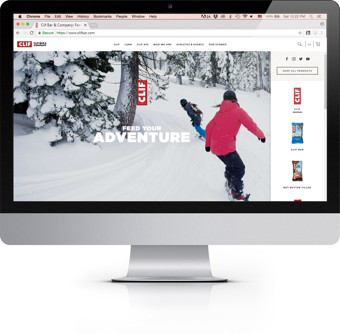
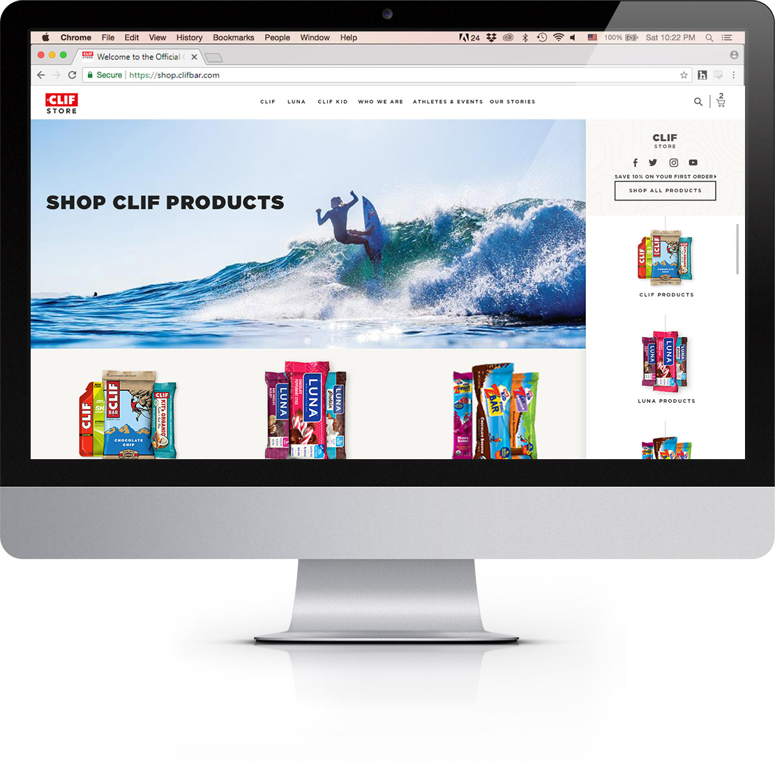
The old design relied on a large megamenu on both the brand and store sites. The two functioned differently from one another although their look and feel were similar, which created a confusing user experience.


Initial designs of the new store included a header that matched the brand site’s navigation exactly for a seamless brand to store experience. Ultimately, the decision was made to keep the store site distinct from the brand site to encourage users to stay and shop.
With a deep product line, including many products in multiple subcategories, navigation could get unruly. I designed a lateral navigation that travels down the page with the user, allowing them to quickly browse products separately from the product grid. This solution anchors the user to their tools, providing them access to the entire portfolio in just a few clicks. It also provides opportunity for further improvement like including a filtering system to bring users to what they want faster.
Reduced friction navigating products and categories allowed users to access more with ease, increasing basket size and expanding brand familiarity. After launching the newest navigation there was an 8% increase in pages per session, 10% increase in session duration and a 7% decrease in bounce rate.
II. Recurring delivery program
A recurring delivery program existed in the old store that offered users discounts and free shipping for signing up, but it lacked visibility and customization. The only mention of the program was a banner that disappeared upon interaction, with little to no reminder of the program throughout the shopping and checkout process.
My proposed flow and design provides the user with options while keeping a consistent shopping experience. Creating an Auto Delivery order doesn’t take the user away from their flow and is similar to creating a one-time order. This helps the user feel confident in their expectations and not distract from their path. There is even an option to add an item to one shipment only, encouraging customers to try new products without necessarily making a commitment.


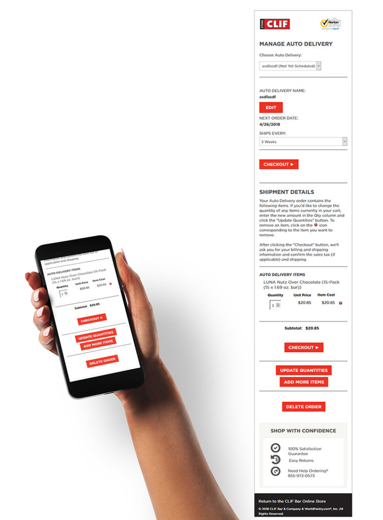

Internally, the goal of the recurring delivery project was to ease the manual labor of a call-in program, while still providing users with maximum customizability. The benefits of the program include saving hundreds of man-hours, assisting in stock management and forecasting, but most importantly giving users direct control of their orders.
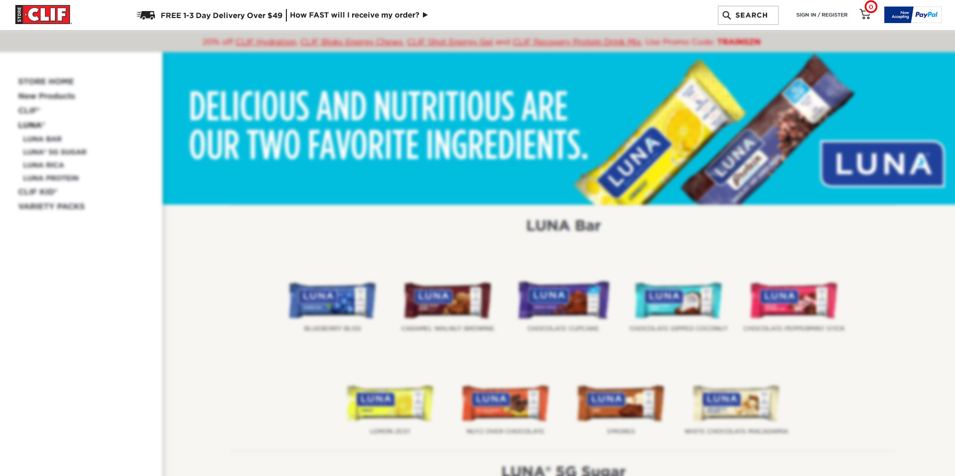
III. Variant display

In the old store it was possible to buy only 12-pack boxes, which didn’t allow for much customization. Upon opening our new store, single bars and money-saving multipacks became available.These new choices created the challenge of a multi-variant display.
Initially, each variant had its own add to cart button – this is good for displaying all the options users have and the savings they could enjoy at a glance. It also allows for the shortest number of steps to checkout. At the same time, the repetitive add to cart buttons dilute the message and could be overwhelming. This is especially evident when multiple sizes are offered, each with a variety of multipacks.


There is a range of solutions to this problem out on the market today, from dropdowns and accordions to popups and interstitials.
This solution provides clean, easy to scan options without requiring interaction. It allows marketers to surface multipack savings and on-site discounts, while preserving the impact of having one call to action. Based on collected store data, a default is chosen for when a user lands on a product page that allows the majority of users to continue on the shortest path to checkout. Future opportunities for improvement could be to display images of each size and pack when selected, or consider other shapes and types of layout based on options.

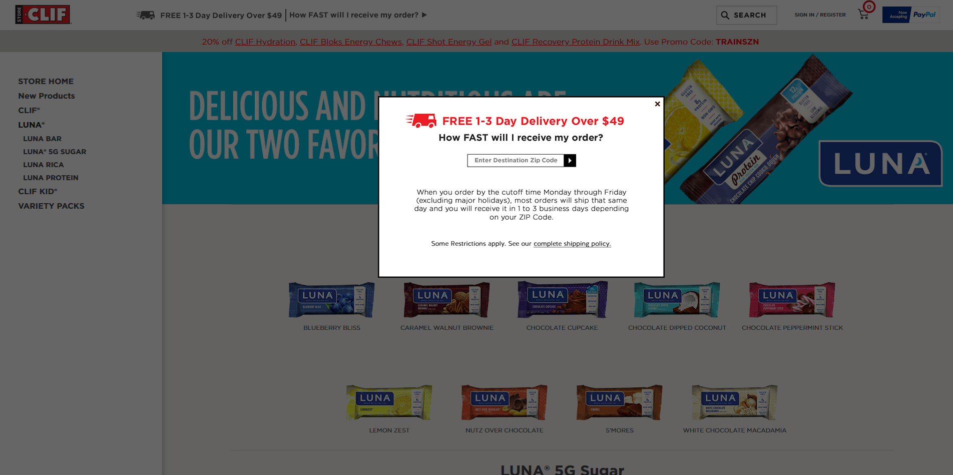
IV. ZIP code delivery time tool
Shipping speed is a major factor when users are choosing to purchase. Through testing it was discovered that simply advertising delivery speeds of three days or less grows a business by 7%.
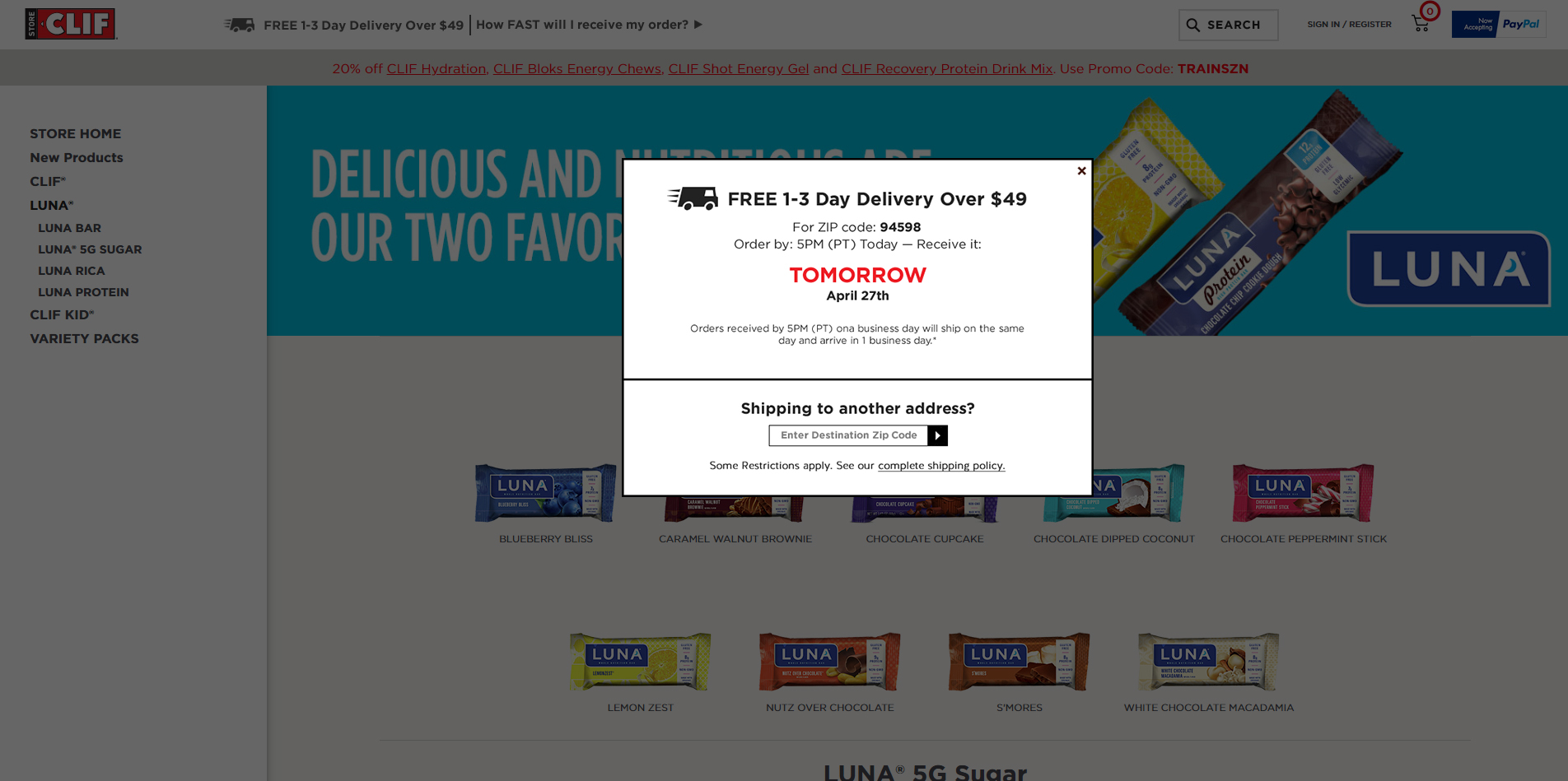
To enhance the message, a widget was designed and developed that tells users when they will receive their order, depending on their ZIP code. This widget appears on each product page, close to the buying options. It is also located in the lateral navigation.

On average, this addition increased revenue by 20%.
To further increase visibility, I redesigned the widget to a version that is pinned to the top of the user’s page, reinforcing their delivery date. This version also enhances usability – the user can get more information or check shipping speeds to other ZIP codes without being taken out of their flow, making them more likely to complete their purchase. Further development of the design could transform the fixed banner into a kind of utility belt for users, complete with their cart and account links for ultimate access and ease of use.
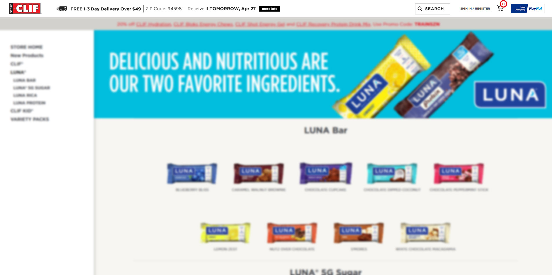
This latest iteration of the widget is responsible for an additional 8-10% growth in revenue over the old version.
V. Cart optimization
The old store would take a user to the cart page after adding an item to their cart, which is a good practice for stores with high ticket items where users are likely to buy just one product. This type of user flow adds obstacles and unnecessary friction for someone wanting to add several items to their cart. This was discouraging customers from placing larger orders.
Upon opening the new store, we created a dropdown cart that shows its contents on hover and offers a path to checkout. The introduction of the product list to the dropdown provided increased visibility, but in order to make edits to their cart a user still had to go to the cart page.

The latest iteration of the dropdown provides the ability to add a promo code and edit cart contents directly in the minicart, as well as multiple checkout options (standard checkout vs. PayPal).This provides the user with more options with less effort earlier in the buying process, and also helps set expectations for their order cost and overall checkout experience. Ultimately, this solution could bypass the cart page entirely, decreasing clicks and friction to checkout.


