Recurring Delivery
UI / UX | Web design | Ecommerce
This project was an internal initiative for an ecommerce company to ease the manual labor of the program in place at the time and provide users with direct control of their orders. As the Visual Designer on a core team of 3, I created the final UI for the functionality, led the user testing for UX, and designed the final product for 20 different brands.
User Flow
Initially, due to time and resource constraints the build began without a UI exploration, and upon walking through the first prototype it was decided that it needed further consideration. I was brought onto the team to evaluate areas of success and friction, and to create a UI that would fit within the established framework yet provide a satisfying user experience.
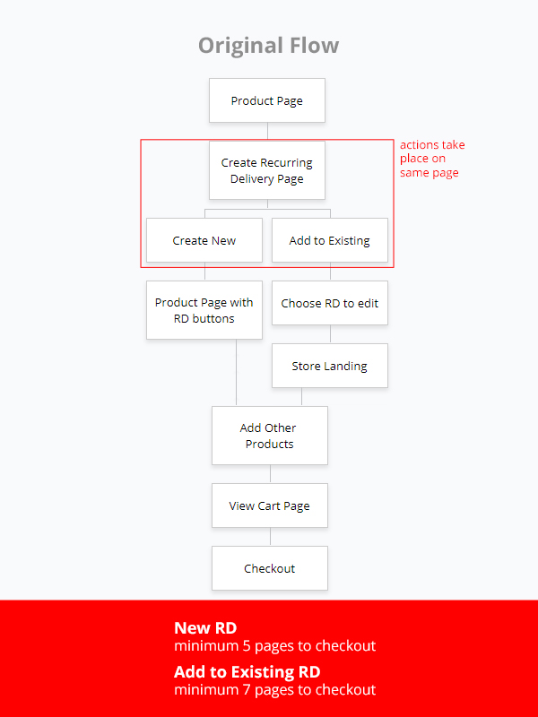
The original flow gives the user plenty of opportunity to get lost or abandon the process simply be being distracted at a key moment. At best the user is required to hit at least 5 separate pages before even entering the checkout funnel. With each additional page that a user must interact with, they are less likely to continue onto the next step and finish their purchase. Each step also presents an opportunity to abandon or forget the process, or worse yet, to exit the shopping experience entirely. My goal was to tighten up those areas, to keep users focused and make it clear what part of the process they are in.
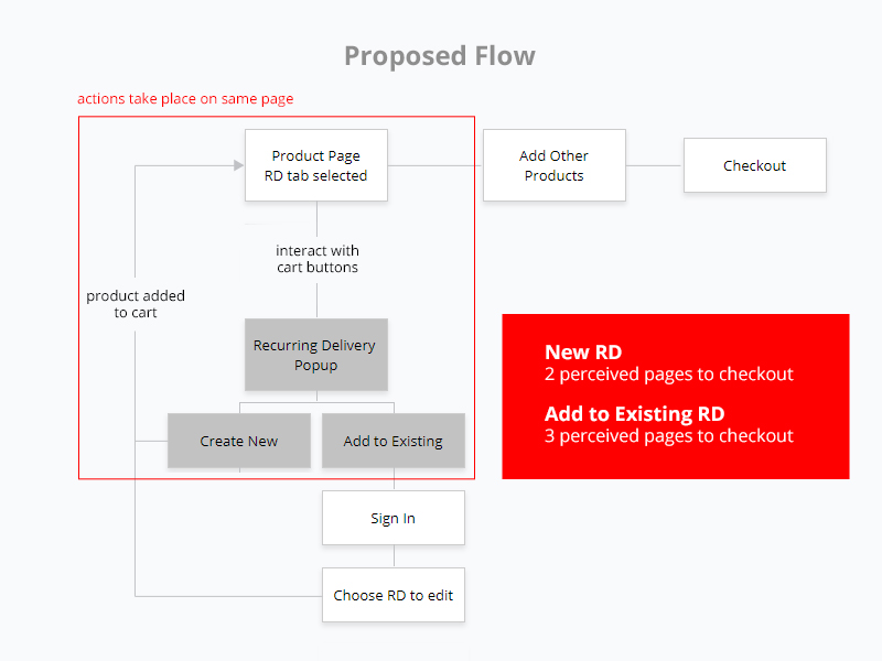
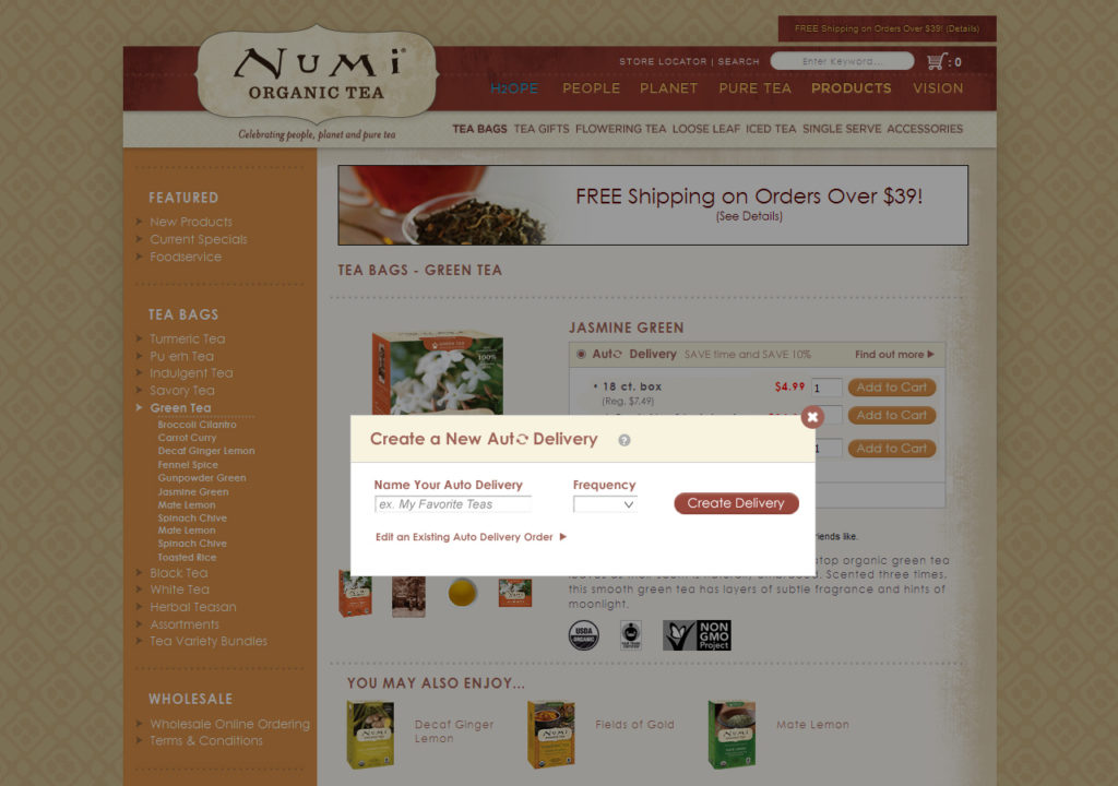
My flow utilizes a series of popups to initiate the program, which creates the perception of staying on the same page the user began on and allows them to contextualize their current place in the process. Even if they walked away from their computer and came back, it would be easy to pick up where they left off. Creating a new order only requires the user to interact with 2 pages, or 3 if adding to an existing order, allowing for fewer exit points and opportunities for confusion.
Original UI
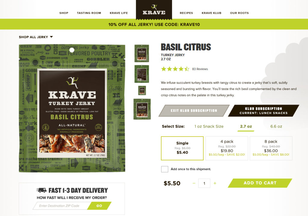
The original UI provided a link to the Recurring Delivery (RD) page on the product page near the add to cart options.
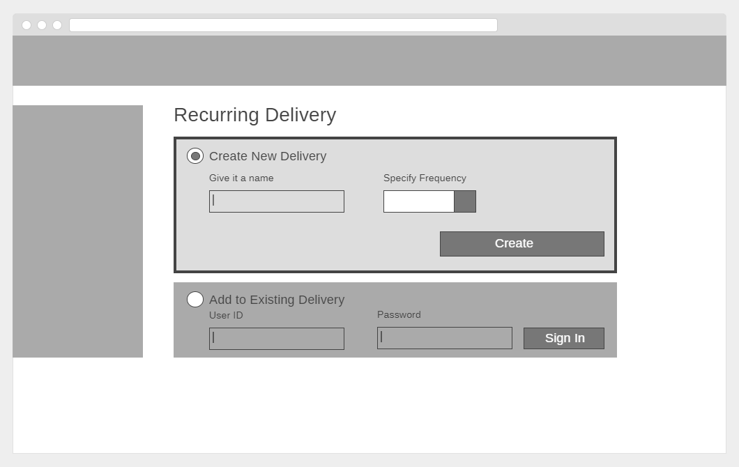
This link would take the user to a separate page where they could create a new RD or sign in to add to/edit an existing RD. If chosen to create a new RD, the user gets landed back on the product page they came from upon clicking “Create”.
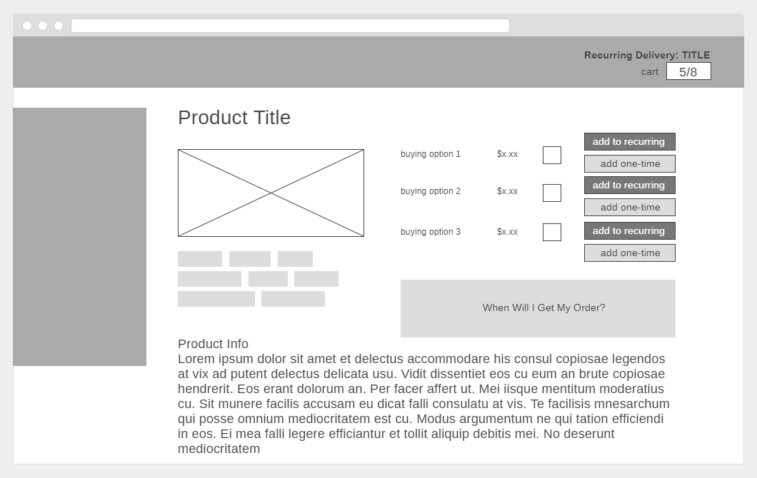
The product page is now updated to show RD prices and buying options, providing the first contextual opportunity to see the benefits of participating in the program. The page also includes the ability to add an item to the delivery once, by providing 2 buttons for each variant of the product. This is a confusing interface and dilutes any call to action, as when presented with too many options it is easiest to make no decision at all.
To indicate that an RD is being created, the title that the user chose for it appears above their cart in the header, where they are unlikely to notice it. Items in the cart are represented with 2 numbers, one that represents RD items and another for one-time items. This layout is confusing for someone seeing it for the first time, with little to no indication of what the numbers represent. To checkout their order or see what products are in their cart, the user must click on their cart to go to the cart page.
Proposed UI
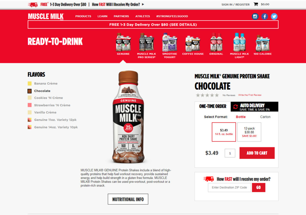
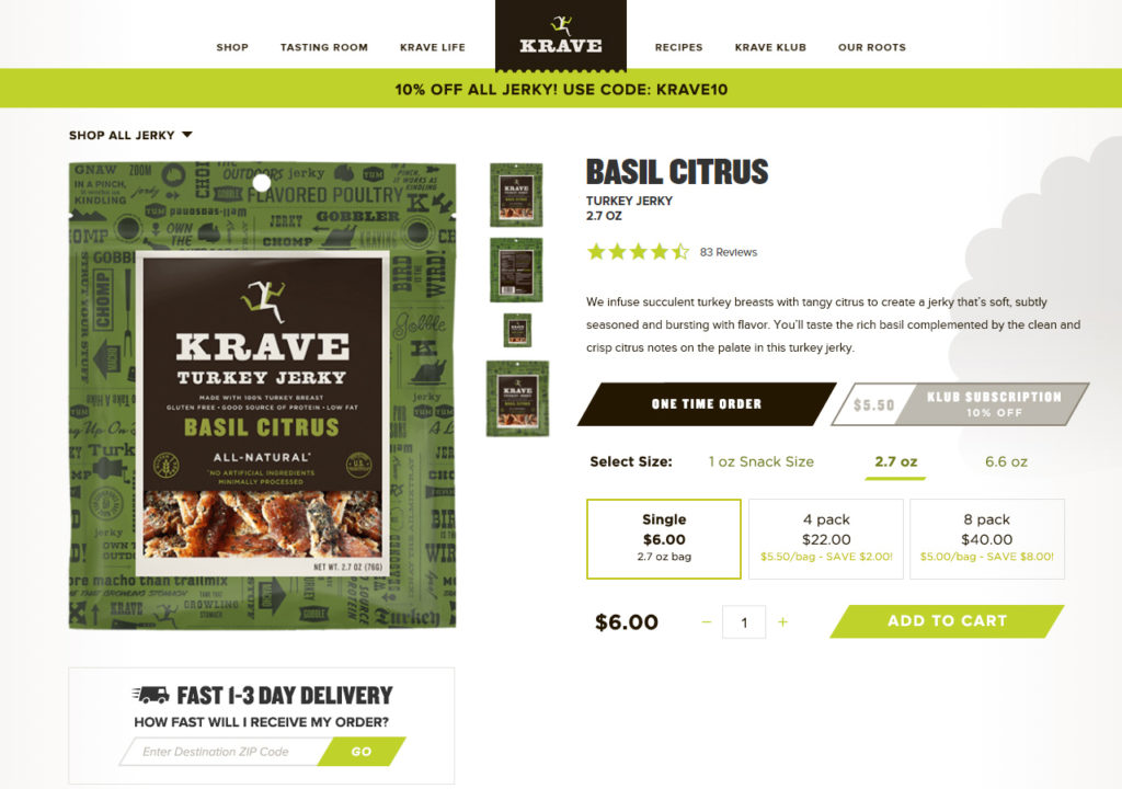
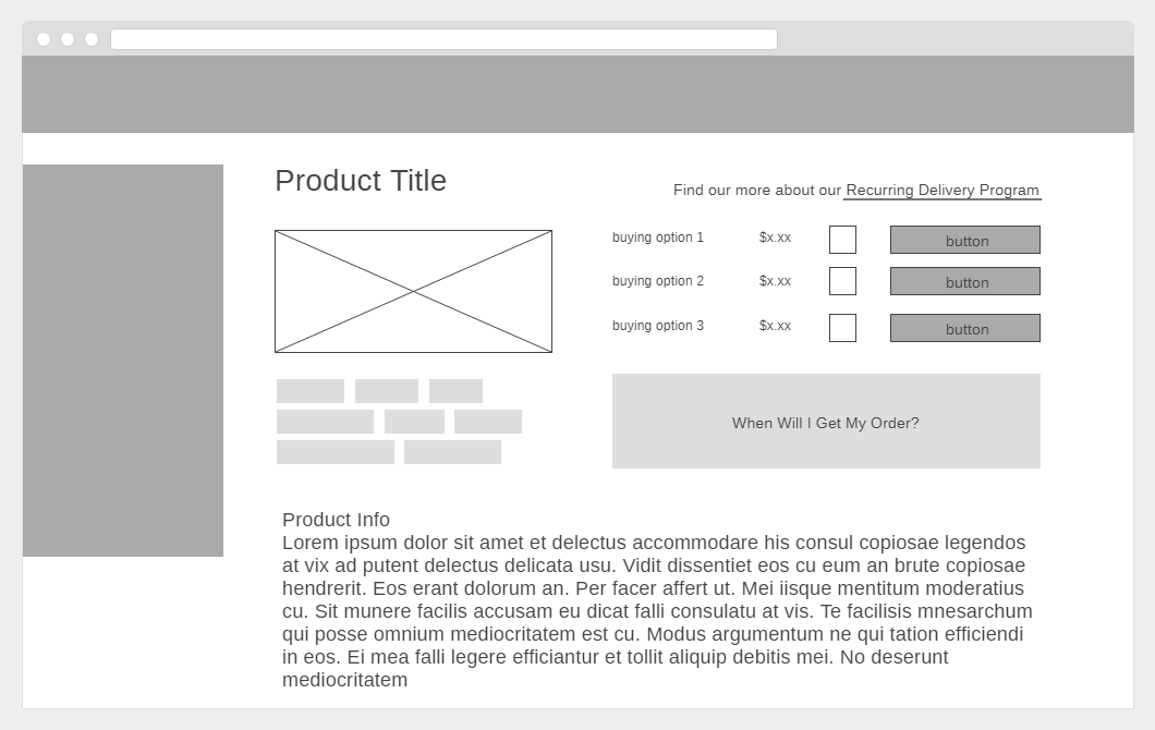
My proposed flow uses tabs on the product page around the add to cart options to differentiate between a regular one-time order and a Recurring Delivery. The tabs let the user weigh their choices before committing to their purchase, allowing them to view RD prices and buying options in comparison with a regular order. This brings attention to the benefits of the program upfront and in the context of shopping without making the user work to recognize it.
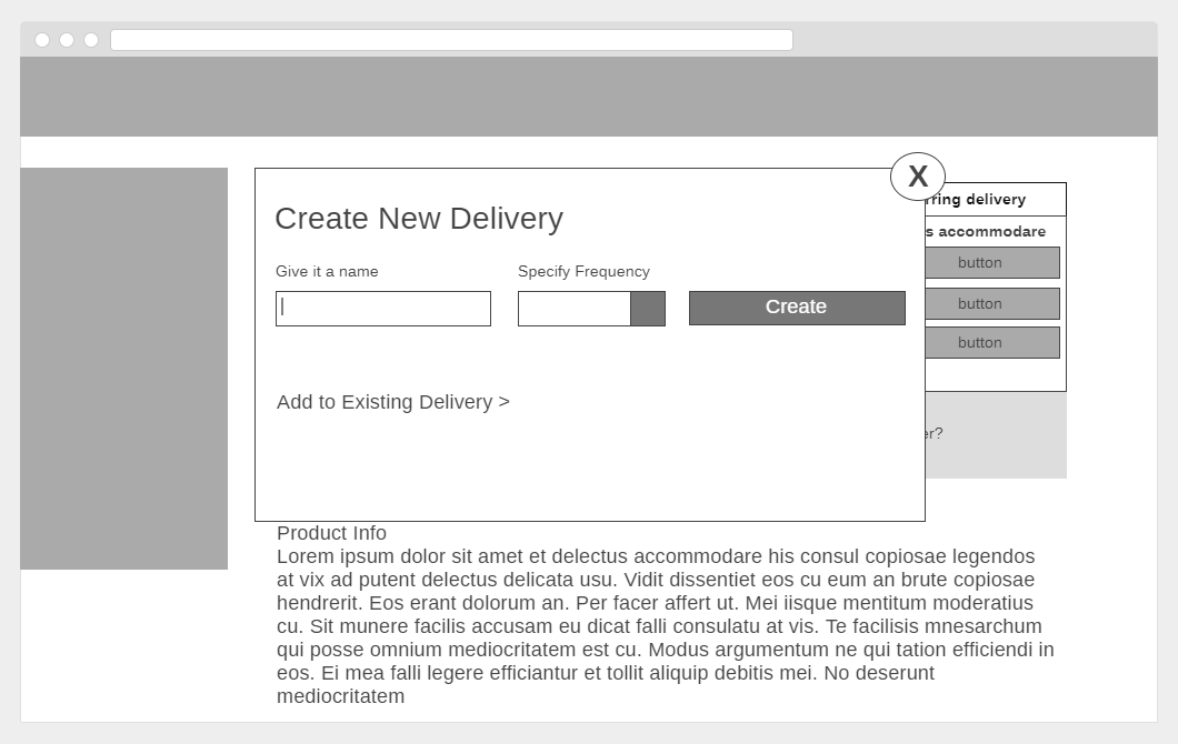
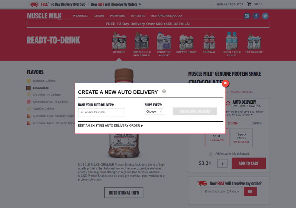
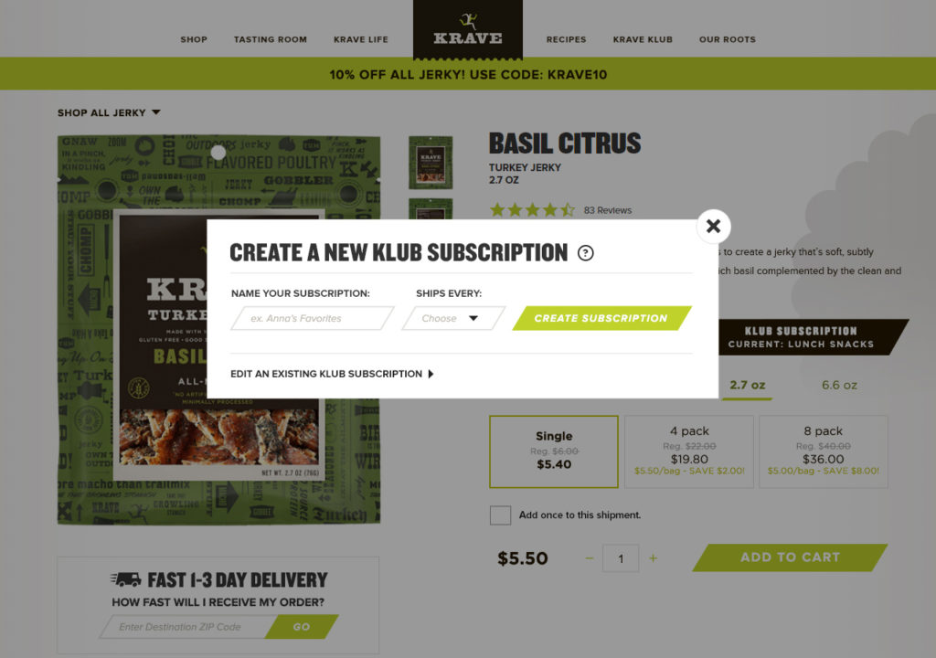
Upon making the decision to move forward with an RD order (by simply clicking the button next to the desired variant) the user is presented with a popup to create a new RD or add to an existing one. By using a popup, the user does not perceive leaving the page they were on which allows for less possibility of losing their place in the process and abandoning it without purchasing anything.
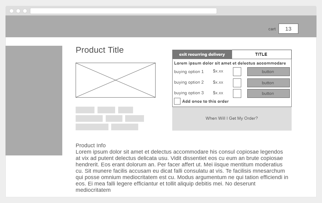
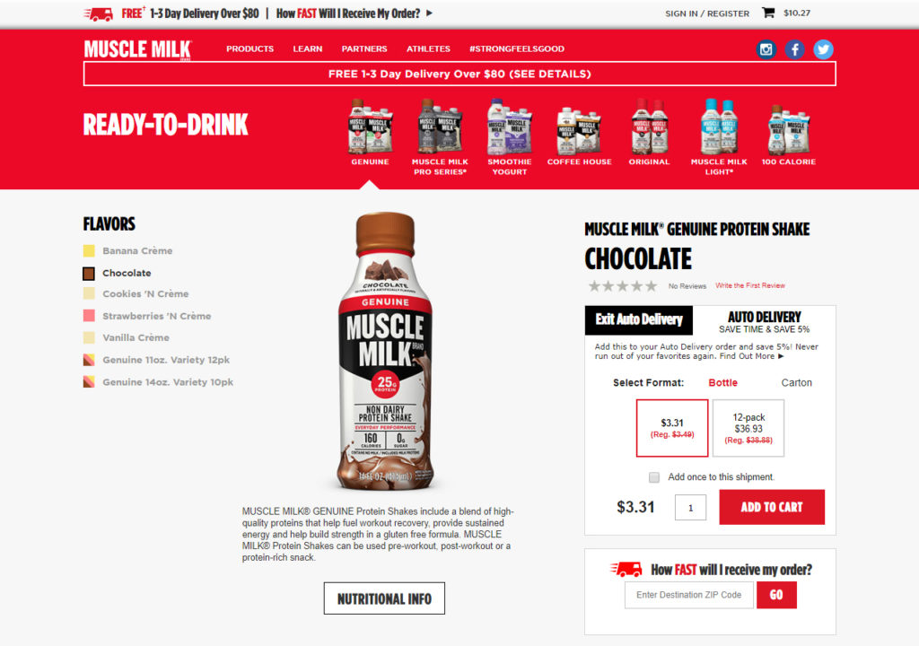
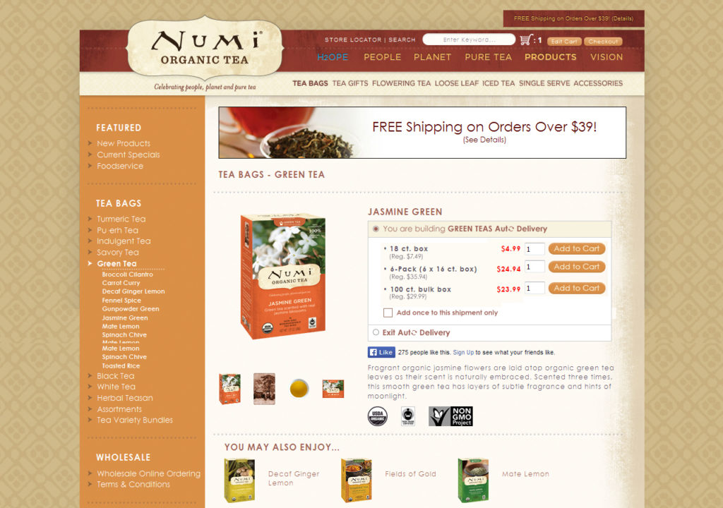
After clicking “Create” the popup disappears and the original variant clicked on is now added to their RD order and cart. To indicate that they are creating an RD the tab displays the title the user chose, and the one-time order tab becomes an exit from the program. These controls appear around the add to cart functionality where the user is primarily focused, serving as a reminder of the process they are in and a method of ending it without exiting the shopping flow.
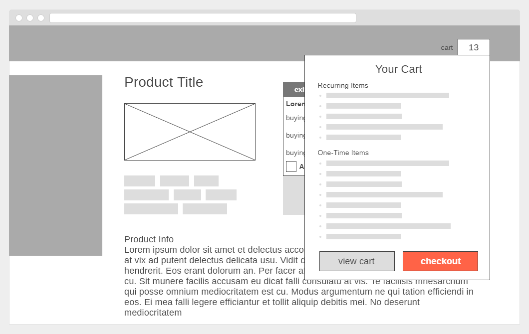
The cart icon shows the quantity of all products added to the cart, both recurring and one-time items. It is represented with a flyout hover state that divides items into RD items and one-time items for clarity and provides a button directly to checkout. This cuts down on clicks and pages encouraging more users to finish the process they’ve begun and convert.


