World Pantry Redesign
Web design | Branding | Identity design | Logo design

Founded in 1998 in the heart of the Silicon Valley/San Francisco innovation hub, World Pantry's vision is to create a lasting company that makes a positive impact by setting a new standard for outstanding service to customers and partners. Over the past 20 years, they have focused on providing world class service to their partners and customers, and have established themselves as a leader in direct-to-consumer, branded e-commerce. At the end of 2017, World Pantry decided it was time for the company brand to reflect their goals and achievements.

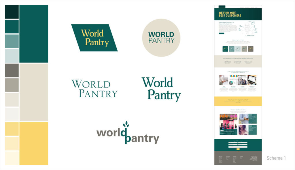
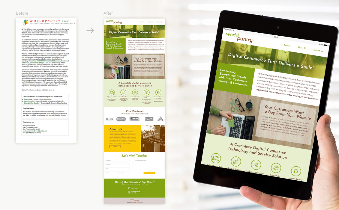
There were a number of challenges in approaching this project. First, the logo and brand were established at the conception of the company, and had not been revisited in almost 20 years. After 20 years, none of the stakeholders felt a strong connection to the old branding, and therefore very little of it could be used. Another challenge was our timeline. We had to determine a brand, an identity, a logo, and build a website incorporating all of it within three weeks of starting the project.
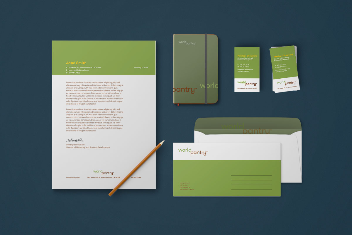
Due to the unique constraints of the project, compounded with the expected challenges of creating a brand, we decided to approach the design in phases. In this phase one, we focused on establishing a personality for the brand and created a solid base from which the identity can flourish in the phases to follow. Through a variety of games and exercises, we determined the brand characteristics and archetypes that resonated most with our stakeholders, and designed a basic logotype and the beginnings of an identity that reflects those values.
The logo is a basic word mark that provides recognition in the short term and has logomark potential for future phases. GT Walsheim font by Grilli Type provided the friendly, approachable letterforms that communicate the “optimistic, joyful, warm and passionate” aspects of the brand that the stakeholders value, as well as the evenly distributed weight and balance reminiscent of an “experienced, dependable, solid and honest” Organization. Lining up the “d” of World and “p” of Pantry can be indicative of a sprig sprouting leaves, creating the potential for a mark to be developed in a later phase. The budding twig could be used to represent the growth opportunity that the company provides its partners and employees, as well as the support and tools necessary to cultivate that growth.


